March 22, 2012

Instagram Sidebar Widget for Blogger

The other day I was asked about my Instagram sidebar widget that I have on my personal blog. They wanted to know where I had gotten it. Truth be told I made it. It's just a simple HTML/Javascript widget that anyone can do. I figured it would be a great idea to post a tutorial on how to make the widget. SERIOUSLY SO EASY!

First things first your going to need to have an instagram account. I'll let you figure that out.


Next you'll want to signup for Followgram.


 Followgram is a web app developed as a way to extend those Instagram's basic functions so appealing to millions of users already. At least that's what they say. It's just a way to see your instagram pictures online in a gallery setting. It's twitter for pictures. Sort of like Pinterest is twitter for creative ideas. 


Before you create the widget you'll need to pick the instagram pictures you would like to use for your widget and get the url of the picture. You can have as many pictures as you would like. I have like 8 pictures on my widget.

To find the URL - First login to followgram and get to your dashboard.


Next click on the picture you would like to use and get to that individual pictures dashboard.


Right click on the image and select view image


The picture now should be the only thing on the screen.


On this screen, in the address bar, there should be the direct link URL to the image.


The direct link URL to this Winnie the Pooh quote is

http://distilleryimage6.s3.amazonaws.com/9b878340695e11e180d51231380fcd7e_7.jpg

Copy the code and save it to a simple text editing document (notepad for PC and textedit for Mac. Don't open a complex word processing application like Microsoft Word. Just use something simple.)

Now go back to your Followgram Dashboard and follow those same steps again until you have gotten the URL's to all the pictures you would like to use. 

These are the 4 pictures I've chosen to use in this widget.


See how I have the unique URL to each image copied to my text editor.


Now it's time to start and finish building the Widget.

Copy and paste the following code into your text editor.


Replace UNIQUE URL with one of the URL's that you have retrieved and saved. For Web Accessibly change the UNIQUE ALT to a short description of the picture. No need to change the height or width. The 100% percentage code will automatically make the image the size of your sidebar.

I was looking at my example blog and I noticed that the 100% code renders different in different browsers. For instance on safari it stretches the photo and in google chrome the picture looks correct. I am adjusting my instructions and I think it would be more advantageous to code the image with the sidebars pixel width. 

on my example blog the side bars width is 220px. Instead of having the width and heights be 100% change it to 220px. your height and width code should look like this.
height="220px" width="220px"
For example this will be the code for the Winnie the Pooh quote.


*PLEASE NOTE: DO NOT DELETE THE QUOTATION MARKS OR IT WON'T CODE RIGHT.

Here is a look at the final code for all four images.


Finally create a new sidebar gadget. Select the HTML/Javascript widget gadget and add YOUR final code to the widget gadget. I suggest building the code in the text editor and then just copy/pasting it in the HTML/Javascript gadget.

Viola! You are done!


*ONE FINAL NOTE: This is not an automatically updating widget. If you want to change the images to more current pictures you will have to do this all over again. But once you've done it a few times you'll be a pro.

To see what the widget looks like with these 4 images you can see it on my example blog. To just see the widget with other images you can view it on my personal blog.

If you have any questions on how to do this please feel free to leave a comment and I will be happy to answer your question. And if you apply this to your blog I would love to see it in action. Leave a comment and post a link. 

I'll be posting a tutorial on how to add the view my gallery link to your blog soon.

February 25, 2012

Photoshop Tutorial; How to Correct Skin Tones

After Elizabeth's super easy tutorial on how to Correct White Balance in Photoshop, I thought it would be good know how to easily correct skin tones. This literally is a 2 minute fix.

You are going to go from this..... 
  
 To this...

See the difference? It's so slight is ridiculous! But so much better!!

First you open up the image you wish to color correct. I chose to use one of the image that Elizabeth had used in her tutorial.

You are then going to make what is called an "Adjustment Layer" ( Click on a circle that is half black and half white)


 You will open a "Selective Color Layer Adjustment"


This is what the dialog box will look like.

For my numbers, I slide the bars to what I felt I needed to do to make the color correction. It will be different for every image.

Selective Coloring is a tricky Dialog Box. Make sure that "Relative" is check and not "Absolute". Depending on the Color you are on (we want to be on "Red" because that is the color we want to eliminate from the skin tones) depends on how you will slide the bars.

Sliding the slider to the right for Cyan will eliminate the cyan color from the image and sliding it to the left will saturate the cyan color. With the other color sliders, (magenta, and yellow) sliding the slider to the right will saturate the Magenta and Yellow color in the image, while sliding it to the left will eliminate those colors. While the Black slider, will add contrast to the image. Slide the black slider to the right to increase the black and slide it to the left to decrease the blacks.

Go and play with what I am talking about. You will see it. Play with each Slider individually, meaning bring each slider back to 0 before you move on to the next to see how the slider works for each color. 


These are the numbers I felt gave me the correct skin tones I wanted. 


Now I erase everything except for the skin tones.


press "E" to select your eraser tool (make sure your "hardness" is not at your hardest)  and "X' to switch your foreground and background colors to make white the foreground color and the black the background color. Then erase everything but the skin tones. It doesn't have to be perfect. I did this in 5 sec, seriously.


After doing that, I still felt it was a little to red. So I created another Selective color Adjustment Layer and only slide the Cyan color 


I now have three layer. My original image, my first selective color layer and my second selective color layer.  Then i saved it as a jpeg as a new file. I always keep my original files.


Now remember it was a hot hot summer day and they were already a little red from the heat, but the image has improved a lot.. no?

Here is a close up of Audrey before and after.

Here is the before and After

 I hope this was helpful!

If you have any questions please leave a comment or email us at lovinglifedesigns@gmail.com

January 19, 2012

How to Create Perfect Levels Photoshop Tutorial

This is a technique I learned a few years ago in one of my photography classes. *Remember I am not the photographer in residence, that's Michelle's deal, but because I majored in Film as an elective course I took a photography class.

There are a bunch of other ways to achieve the same result but this seems to be an all around easier way to white balance/correct the levels in your images in Photoshop without just using the auto white balance button or auto levels button.

This is a quick 2-5 minute fix for those pictures that just don't seem to be the right color.

This is the picture I would like to fix. It's bland, the color is flat, it's dingy and not to mention really really yellow. It's a picture of my husband the day he blessed our little one almost 5 years ago.


So here you have it How to white balance and create amazing levels in Photoshop.

1. Open the file you wish to work on.


2. In the adjustments layer box (should be on the right side of the window) click on create a new levels adjustments layer.


A new layer will appear just above your background layer/original image.


 3. In the Levels adjustment window you'll want to change the drop down menu from the RGB (all colors) channel to just the red channel. What you're doing is isolating the reds that are in the picture.


4. Hold down the ALT key and click and hold the black triangle below the levels histogram box.


5. Your image will go red, slide the black triangle toward the middle of the box, when you see little black dots start to appear stop. Sometimes you won't have to move the triangle. In my case, I did not need to adjust the lower red levels in this picture. Note that the number under the black triangle remains 0.


6. Hold down the ALT key and click and hold on the white triangle below the histogram box.


7. Your image will go black, slide the white triangle toward the middle of the box, when you see red dots start to appear stop. Like with the black triangle you might not need to slide the triangle to make the dots appear. In my case, I did need to slide the triangle to adjust the lighter reds. Note that the number has changed from 255 to 236.


There you have it. You have adjusted the darker reds and lighter reds of your image. No need to adjust the greys/middle tones. You'll notice your image has a bit of a red tint. Don't worry it will go away as you continue to adjust.


8. Go back to the drop down menu and select/isolate the green channel.


9. Repeat steps 4-7 for the green channel. Note that again ,in my image, there was no need to adjust the darker greens and the number remained 0, but my lighter greens needed to be adjusted and changed from 255 to 215.


Now the image is a little green.


10. Go back to the drop down menu and select/isolate the blue channel.


11. Repeat steps 4-7 for the blue channel. Again no change with the darker blues, but the lighter blues changed from 255 to 161.


Viola you are done!

 
Now, make any minor adjustments you feel you need. Maybe you need to adjust the red a little or it looks a little too blue. Just have fun with it.

Once you are done with the adjustments merge the two layers together (or not) and save the file. Most times because I don't want to lose the original file, I will save it with a new name in the same location.

For instance this pictures title is IMG_0528. My newly adjusted picture kept the same name but I added (fixed) to the end of it. It saves the two right next to one another so I can see what adjustment was made.


After that I just close out the Photoshop file. No need to keep the PSD if I have saved the original. Hard drive space, at least on my computer, is a hot commodity and I don't want to bog down my hard drive with PSD files that I won't ever use again.

So here is a side by side look of the before and the after.


I hope you found this tutorial helpful. I found the knowledge EXTREMELY helpful when I learned it in my class.

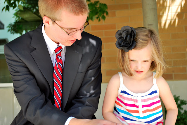
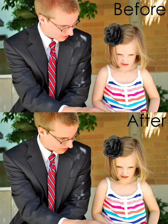
Here is other example of a before and an after with this technique.  It's a picture of my little brother and my daughter Audrey, the one getting blessed in the tutorial, an hour before he headed into the MTC in Provo.

The original image looks great. It has great color. I made sure I white balanced the camera before taking the picture. Everything was reat with the picture.


To a novice eye you wouldn't see a problem with the original image but, compared to the adjusted picture (below), you'll notice that the original looks almost flat and bland. The blacks look almost grey. His red tie doesn't seem as bright.


The new image is lively and rich with color.

Here is a close up of  difference between the two images.


Can you believe that a 2 minute adjustment can make such an amazing difference? Who'd a thunk it!

If you have any questions or suggestions please feel free to leave a comment or email us at lovinglifedesigns at gmail dot com.

Coming soon: Michelle is going to be doing a post about how to quickly correct skin tone.