December 28, 2011

Striped Baby Boy Photo Birth Announcement - {Free Photo Birth Announcement}

This is another announcement (4x6) that I made a few years ago and just forgot about. I think the thing I like the most about this design is the colorful stripes in the middle of the page.

I found the picture of the little guy on the Internets. But I am sure that you could recreate this picture pretty easily at home. Maybe Michelle might be willing to do a post about DIY baby photography.

Free Baby Announcement

The only thing you need to do is customize the babies information. It really shouldn't take more than 15 minutes for you to start and complete this little announcement.

After you download the PSD file you'll need to download the fonts I used. The two fonts for the announcement are Halo Handletter and Geo Sans Light. Both are downloadable from DaFonts.com

*click on the picture to be linked to the download page.

Halo Handletter


Geo Sans Light

If you have any problems feel free to email me and I will gladly help. (lovinglifedesigns@gmail.com)

*Remember Loving Life downloads are for followers only. We ask that if you download our creations that you become a follower, it only takes a second. Thanks.


December 16, 2011

Simple Scalloped Edge Birth Announcement - {Free Birth Announcement}

I told you we would be back soon.

Today I have a simple birth announcement (4x6) I made a few years ago and forgot about until today. I really love how elegant the scalloped edges make the announcement look. One of the things I like about this announcement is that you can use a picture you took while in the hospital. I used a picture of my little one when she was 24 hours old and felt like it was just a perfect picture for the announcement (the date says 2011, but my little one was born in 2006 - I can't believe I'll be having a 5 year old in 4 days)

I have 3 colors for you to choose from yellow, pink and blue. Personally the yellow is my favorite look.

free yellow birth announcement

free pink birth announcement
free blue birth announcement

This announcement requires a few steps but it shouldn't take you more that 15 minutes TOPS to start and finish the file.

First things first you need to download the font I used for the text and install it. 

click the image to be linked to the fonts download
Once you've installed the font edit your text.

The next thing you want to do is replace my kids picture with yours. If you're not a pro it might take a try or two but I'm sure you'll do just fine. I have guides in place so you can line your picture up perfectly with the scalloped border. This is how I made my original picture fit in the space.

Original image

1. Open your original picture and copy/drag it into the announcements file.
2. Re-size and position it where you want it within the guidelines.

how to add a picture to birth announcement

3. Select the rectangle marquee too (m) and create a rectangle the size of the guides.

how to add a picture to birth announcement

4. Right click and select layer via copy - this will create a new image layer from within the dancing ants.

how to add a picture to birth announcement

5. Delete your original picture layer.

how to add a picture to birth announcement

6. Voila, you have done it.

Last thing to do is save the file and then get it printed. 

I would like to mention that the flowers I used in the file were created by jen of pixels and ice cream.

If you have any problems feel free to email me and I will gladly help. (lovinglifedesigns@gmail.com)

*Remember Loving Life downloads are for followers only. We ask that if you download our creations that you become a follower, it only takes a second. Thanks.


December 12, 2011

sorry for the lack of posts...

It's been a bit of a hectic time for the two of us. We took a hiatus for Thanksgiving and then the week after we went on vacation (got to see one another, that was fun) and then both proceeded to get sick (including both our little families) after the vacation. We've not really had too much time nor too much energy the last few weeks to do any post.

No worries we'll be back soon.

November 10, 2011

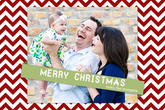
Modern Chevron Christmas Photo Card - {free Christmas card}

Today I have another photo Christmas card. It's a simple chevron design.

free photo Christmas card

I again borrowed the family picture from Michelle's Photography site. I don't have a picture of my family. Although we are twins, michelle is much more photogenic than I. Plus taking pictures makes my husband and I uncomfortable. I know, weird. (hopefully in 3 weeks we'll have a family picture that I'll be willing to share)

You have two different sizes to choose from 4x6 and 5x7.

The file is a Photoshop file so that you can change the family name (the font for that is Rockwell).

The family picture is meant to be a square so you'll have to crop your family picture to make it fit. The Photoshop file should have guidelines for where the picture should start and end but in case they don't show up, the picture starts 1/4 of an inch from the top and ends 1/4 of an inch from the bottom, and it starts and ends 1 inch from the sides. If you follow those dimensions it should fit perfectly.

Let me know if you are having troubles getting the picture to fit right.

One more thing....I do have a slight drop shadow on the picture and the banner. Here are the constraints I used, you'll have to add them to your family picture.


NOTE: The bottom of the banner doesn't show that there is a layer style. Trust me there is. Don't add a second drop shadow to the bottom ribbon or it will make it look a little funny.

Enjoy and as always, it's free.

I would love to see your final card. If you make one from our designs email us...we would love to highlight it on the blog. 

*Remember Loving Life downloads are for followers only. We ask that if you download our creations that you become a follower, it only takes a second. Thanks.


To download the 4x6 go here.

To download the 5x7 go here.

November 2, 2011

Photo Holiday Card - Noel {Free Christmas Card}

Today we are going to continue with the Free Christmas Card designs


This one I did last year for my own Holiday cards, but never was able to send it out. I thought someone else might enjoy it this year. 

You can add your image and edited the family name in photoshop.

It's a 5x7

Enjoy!

The font for "the morgan family" is halo Handletter from Dafont.

you can download it here

October 31, 2011

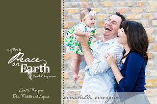
Photo Holiday Christmas Card - Peace on Earth {Free Christmas Card}

I know Halloween isn't over yet, but I'm just getting more and more excited for the Holiday Season.

Today I wanted to share with you a Christmas card that I created for you to download for free. I borrowed the picture from Michelle's Photography work. It's a picture of her and her family that she did. Pretty talented huh?


It's pretty simple but I really like how the Peace on Earth turned out.

You have four colors to choose from red, blue, dark green, and light green. Plus two sizes to pick a 4x6 or a 5x7.


The file is in a Photoshop format since you need to be able to change the family names and the picture. You just need to download one file and it will contain all the different elements you need to finish your Christmas card.

If you have any questions feel free to leave a comment with your name and email and I will be happy to answer it.

One more thing....You will need to download and install the font Halo Handletter from DaFont.com (pictured below) in order to change the wording of the font.  Otherwise Photoshop will try to find you a replacement font and it never does a great job at finding a new one.


Enjoy and as always, it's free.

*Remember Loving Life downloads are for followers only. We ask that if you download our creations that you become a follower, it only takes a second. Thanks.

4x6 download


5x7 download


October 27, 2011

Two Little Chefs Blog Redesign

Kelly, one of the co-writers for the blog Two Little Chefs is an old friend of ours and best friends with our older sister Katherine. A while ago I asked Kelly if she would be interested in a free redesign of her blog and she graciously agreed to us designing the blog.

Two Little Chefs is the first non-family site that I have ever ventured to create. I was really excited about the idea of doing something for an actual client. Kelly thanks again for being willing to be my first client and thanks for the wonderful praise you made about us.

It took us a few weeks to finish. Mainly, we don't have all the time in the world to devote to creating our free designs, but we attempted the best we could to have a quick turn around.

One of the things I love about the blogs new design is that it's fully customizable for Kelly and Caroline. Everything, other than the header, is created with HTML and CSS. If in 2-3 months they decide to add a new widget to the side bar, they simply just have to create the widget and the HTML and CSS take care of making it look like all the rest. If they decide to add another page to the site. BOOM! Done! No need to contact me to create the page or create an image file for the navigation bar.

Lets take a look at this blog design, shall we?

Michelle handled the header. Which I personally think turned out great.


And I handled the sites design.


We're in the final stages of the design, just adding a few tweaks and what not, but it's basically done.

Go over and take a look at their amazing cooking blog. They have hundreds of recipes that they have tried and tested and every single one looks absolutely delicious. I've tried my hand at one or two...but I'm not much of a chef.

October 17, 2011

Taking Orders - Free Christmas Card Designs

I just want to announce, to those that are interested, that if you would like a custom Christmas card design we are happy to oblige. 

Here is one that I made a few years ago. I made it but never sent it out. I tend to do thinks like that all the time. I think it was because I was planning on doing family pictures and replacing the picture of my daughter with a picture of the family but never got around to making an appointment for that. Another thing that I plan to do but tend to not follow through. (my husband and I photograph horribly)


Email us with the dimensions, a picture that you would like to use, and all additional information that you would like to include in the design and we will attempt to make two separate designs. One created by Michelle and one created by Elizabeth.

Then your task is simple. Pick one to send out or don't. Just let us know with plenty of time so that we can create it for you.

our email is lovinglifedesigns at gmail dot com

Save the Date - Baby Style {Free Printable Card}

I am sorry that we've been gone the past little while. I have a pretty decent excuse that I'll be sharing with you today.

I am 16 weeks pregnant. You would think that by now my morning sickness would have disappeared, but, alas, it has not. I spend most of my time at work actually working and normally during my limited free time, (bad worker, I know) I work on Loving Life ideas, but because of the 24 hour morning sickness I tend to sit and stare at my computer screen, during my free time, hoping the feelings will subside. It never does. Now you know why I have not worked on any projects for a while.

Today I wanted to present to you the baby announcement I made for my family, announcing the arrival of our precious little monster. I thought it was a creative way to announce a pregnancy.

I present to you my feeble attempt at being cute and what not.


I printed it and put it in a frame (intending to replace the save the date card with an actual baby photo) and presented it to my mom...thats how I wanted it to happen but it didn't quite go like that. You can read more about what happened here at my personal blog.


Today I have for you a photoshop file for you to download and adjust as needed. You might have to do some kerning to get the date to be inline with the save the date. You'll figure it out.

The file is intended for a standard 4x6 picture frame.

Enjoy and as always it's free.

*If you download our stuff we ask that you follow us. It's only takes a second. Thanks.

September 28, 2011

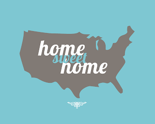
Reader Request - Home Sweet Home Utah Edition

This is an inaugural post. It's our first READER REQUEST.

Stacey requested that we create for her a Home Sweet Home Utah Edition in Blue.


Stacey we are happy to oblige. I do apologize about the delay I couldn't find the file on my computer and had to re-create the file. This is an important lesson in backing up your files and not leaving an unsaved file open on the family computer. I think my wonderful husband closed out the program and didn't save the file. Oh well lesson learned.

I hope you enjoy.


If anyone has another request please feel free to ask.

September 27, 2011

Come What May and Love It - Free Poster

With General Conference this weekend, I thought that I would put up one of my favorite quotes by a General Authority.

I only have two colors for you to download right now. I will get more. I was just never happy with any of the other colors. They are both super super bright.

Enjoy and as always it's free!

*If you download our free stuff we ask that you follow us, it only takes a second. Thank you! 


September 8, 2011

Be Attitudes - President Gordon B. Hinckley {Free Printable}

I saw something similar to this on Pinterest the other day and was inspired to re-create it with Gordon B. Hinckley's Be Attitudes.


I hope you enjoy it and as always it's free.

*If you download our free stuff we ask that you follow us, it only takes a second.

August 26, 2011

Live Love and Laugh Often Poster

I did this poster a few months ago actually, and never got around to finishing and tidying it up, until now. Life kinda got in the fast lane for a while. It is now settling down to a speed I can handle, but i am sure it will not last.

For todays download, I have a fun poster for you, "Live, Love and Laugh Often." It's a 8x10 and I decided to get a little color crazy. Okay, not to crazy, just some pop to it.

Remember, as always, it's free!


Enjoy!

July 29, 2011

Home Sweet Home United States Style {free printable}

Last night after blog surfing I was inspired to create a home sweet home poster. Instead of matching the well known phrase with a house I thought it would be an interesting twist to place the home sweet home with a silhouette of the united states. It's really not meant to be 4th of Julyish (plus we are a month past that) but it is a little patriotic. Something small to remind us that we love our country all year long. Same reason as to why I have my nativity picture displayed all year. How cute would this be in a white frame above your front door? The answer....incredibly adorable.

Home Sweet Home Poster blue
Home Sweet Home Poster green
Home Sweet Home Poster pink
Home Sweet Home Poster yellow

I think this could be a really great idea for different states or even other countries posters. If you would like me to create one for your state become a follower and then let me know.

I did a mock up of Utah to see what it would look like.

home sweet home poster utah

Enjoy & as always, it's free.

The print size is 8 x 10 and should fit a standard 8 x 10 frame.  

*As a courtesy we ask that you follow us before you download our designs - it only takes a second*


July 15, 2011

Delete "Showing Posts with label..." message in Blogger Tutorial

Today's blogger tutorial is on how to get rid of the "Showing posts with label..." message that appears at the top of your blogger blog when someone is looking at your labels. (pictured below)


I don't know if it is something that bothers other people but it's something that I have never liked. I really can't quite put my finger on the reason.

It is a really simple HTML fix that should only take about 2 minutes to do.

• First, you're going to want to log into your dashboard, click on the design tab and then Edit HTML.

    *NOTE: Before you do any thing that is going to mess with your template - Download and Save your template....you don't want to ruin your blog if you make a mistake. I can not stress that information enough.

    • Next, you will check the box that says Expand Widget Template.

      • Hit ctrl F for the find function and you're going to want to find the following line of code.

      div class='status-msg-wrap'

      • Then delete the following 10 lines of HTML code. Make sure you get the 3 </div> lines at the end of the code otherwise your template editor with give you an error message.


      • Now save your template and then go test your labels.  

      It worked for Loving Life Designs Blog, SEE, it should work for yours.

      Happy Coding.

      July 12, 2011

      Search Ponder and Pray Poster

      Today we have a 8x10 poster... but before I show you the design, lets discuss.......

      READ ME*****
      We have noticed that there have been a lot of downloads lately and we are so extremely happy that you love our stuff enough to put them in to your homes and use them. But as a nice jester or saying...." if you download.. please start following".  It would be really awesome!!!! Just click that "FOLLOW" box on the right column under "Followers"... We would love you so very very much if you choose to do that.


      Well now to show you what we have for you today. This was by far one of my favorite songs in church primary while growing up. I always catch myself singing or humming it randomly through out the day. It's a beautiful song. The poster is an 8x10. I couldn't work with a good smaller size poster. I apologize.


      Remember... As always.. it's free!!!!

      Enjoy

      July 5, 2011

      Alphabet Nursery Poster - Free

      I've seen this look trending for the past few months and I decided to create an alphabet poster based off the trend. I really like the modern, chic clean lines the poster creates and not to mention the oh so wonderful color scheme. So bright and cheery.


      I only did one color scheme. If you would like to see a blue or pink one let me know and I'll whip one up. If you want one that is custom for your little ones room send me some color samples and I'll make one.

      8.5 x 11 poster


      11 x 14 poster


      11 x 17 poster


      Enjoy and as Always, it's free.

      June 28, 2011

      How to Create an Automatic Fading Slideshow in Blogger Part 2

      *UPDATE - February 27th, 2013: Since this tutorial has been having so many problems I have created a new tutorial with a better slideshow method. Check it out. 

      *UPDATE - September 22nd, 2012 @11:40PM: I found the problem to the static image that was talked about in the comments. The unique IDs in the first container "slideshow" and "slideshow background" got switch. I've made the correction. If the static image continues to be a problem please let me know. 

      *UPDATE - September 22nd, 2012 @11:00PM: I've had a few comments about how this slideshow doesn't work. I'll see what I can do about fixing the problem. I am sorry for the trouble and the inconvenience. 

      Today I am finishing up my post on how to create a fading photo slide show in blogger. An example of the slide show can be seen here.

      If you missed my previous post on this subject you can catch-up here.

      Last time I focused on prepping the slide show. This time we'll be learning how to place the slide show on the blog. 

      Like I said in my last post. I found the majority of my information from this site.  They do a really great job on teaching you how to create the slide show but there is a lot of information and I wanted to make it "easy" for non HTMLers to use the slide show. Plus they wrote the code for a generic website and I wanted to focus it for blogspot users, sorry wordspress.  However, we'll be using the sites provided javascript to make the slide show run.

      The slide show is split into 3 different parts.
      1. A container for the slideshow
      2. Javascript to make the slideshow function
      3. and another container that runs the slide show.
      For our container we'll be using a <div> tag.  Basically a <div> tag defines a section in the HTML document. For our purposes the <div> tag will act as our container.

      Before we can create our container we must first give our slide show a home on the blog. The slide shows home will be a custom widget that we create. To create the widget go to your blog setting and click on the design tab and then the page elements link.


      After that you are going to want to click on the add a page element link.


      In the window that appears scroll down til you find the HTML/javascript widget.


      The configure widget window is where we will be building our slide show widget. Don't give the widget a name otherwise text will appear above the slideshow....unless you want that. You can say something like "Our trip to Disney"  or "Our Family Portraits." It's whatever you want. It's your widget.


      Now that we have given our widget a home lets get to coding.

      First thing we need to do is create the container for the slideshow and in this container we need to specify our slide shows background image, assign the background image a unique id, assign our container a unique id, specify our background images url, and define the dimensions of the slide show. 

      My containers unique id is slideshow and my background images unique id is slideshowbackground. This is important for later and if you want to have more than one slide show on your blog. If you want more than one slide show you'll have to change the unique id's of the second slide show element.

      You're going to want to type the following code into the content box.

      <div id="slideshowbackground><img border="0" div="div" gt="gt" height="your height" id="slideshow" src="your images URL" width="your width" />


      Like I explained above I've assigned my container a unique id and my background image a unique id. I've also specified my containers dimensions within this <div> tag. Those dimensions should match the dimensions of your images. Your width= should reflect your images width and your height= should reflect your images height. You'll also need to define your images URL source.

      Your code should look similar to this

      <div id="slideshowbackground"> <img border="0" height="234" id="slideshow" src="http://i556.photobucket.com/albums/ss5/ejspencer/test%20stuff/testforslideshow3-1.jpg" width="900" /></div>

      I created 3 images that were 900px wide and 234 px high. So I have appropriatly placed those numbers in the code. My source images url is http://i556.photobucket.com/albums/ss5/ejspencer/test%20stuff/testforslideshow3-1.jpg.

      DON'T PRESS SAVE & CLOSE THE CONFIGURE BOX WE ARE NOT DONE YET!

      Just as a refresher here are my images once more. 


      Following along okay?

      Next thing we need to do is create the Javascript that defines the slide shows functions. This is easy peasy simply copy and paste the following after our containers division tags </div> end code.


      <script type="text/javascript">
      // Browser Slide-Show script. With image cross fade effect for those browsers
      // that support it.
      // Script copyright (C) 2004-2008 www.cryer.co.uk.
      // Script is free to use provided this copyright header is included.
      var FadeDurationMS=1000;
      function SetOpacity(object,opacityPct)
      {
        // IE.
        object.style.filter = 'alpha(opacity=' + opacityPct + ')';
        // Old mozilla and firefox
        object.style.MozOpacity = opacityPct/100;
        // Everything else.
        object.style.opacity = opacityPct/100;
      }
      function ChangeOpacity(id,msDuration,msStart,fromO,toO)
      {
        var element=document.getElementById(id);
        var msNow = (new Date()).getTime();
        var opacity = fromO + (toO - fromO) * (msNow - msStart) / msDuration;
        if (opacity>=100)
        {
          SetOpacity(element,100);
          element.timer = undefined;
        }
        else if (opacity<=0)
        {
          SetOpacity(element,0);
          element.timer = undefined;
        }
        else 
        {
          SetOpacity(element,opacity);
          element.timer = window.setTimeout("ChangeOpacity('" + id + "'," + msDuration + "," + msStart + "," + fromO + "," + toO + ")",10);
        }
      }
      function FadeInImage(foregroundID,newImage,backgroundID)
      {
        var foreground=document.getElementById(foregroundID);
        if (foreground.timer) window.clearTimeout(foreground.timer);
        if (backgroundID)
        {
          var background=document.getElementById(backgroundID);
          if (background)
          {
            if (background.src)
            {
              foreground.src = background.src; 
              SetOpacity(foreground,100);
            }
            background.src = newImage;
            background.style.backgroundImage = 'url(' + newImage + ')';
            background.style.backgroundRepeat = 'no-repeat';
            var startMS = (new Date()).getTime();
            foreground.timer = window.setTimeout("ChangeOpacity('" + foregroundID + "'," + FadeDurationMS + "," + startMS + ",100,0)",10);
          }
        } else {
          foreground.src = newImage;
        }
      }
      var slideCache = new Array();
      function RunSlideShow(pictureID,backgroundID,imageFiles,displaySecs)
      {
        var imageSeparator = imageFiles.indexOf(";");
        var nextImage = imageFiles.substring(0,imageSeparator);
        FadeInImage(pictureID,nextImage,backgroundID);
        var futureImages = imageFiles.substring(imageSeparator+1,imageFiles.length)+ ';' + nextImage;
        setTimeout("RunSlideShow('"+pictureID+"','"+backgroundID+"','"+futureImages+"',"+displaySecs+")",displaySecs*1000);
        // Cache the next image to improve performance.
        imageSeparator = futureImages.indexOf(";");
        nextImage = futureImages.substring(0,imageSeparator);
        if (slideCache[nextImage] == null)
        {
          slideCache[nextImage] = new Image;
          slideCache[nextImage].src = nextImage;
        }
      }
      </script>

      Make sure you copy the entire thing. It's a long code.

      The last thing we need to do is create a container that runs the slide show and that defines the images that we want to use for the slide show.

      Paste the following code into your configuration box. After the javascripts end code </script>

      <script type="text/javascript"> RunSlideShow("slideshowbackground","slideshow","your list of images",5); </script>

      In place of your list of images you're going to list the direct link url of all your images. My three urls are
      1. http://i556.photobucket.com/albums/ss5/ejspencer/test%20stuff/testforslideshow3-1.jpg
      2. http://i556.photobucket.com/albums/ss5/ejspencer/test%20stuff/testforslideshow2-1.jpg
      3. http://i556.photobucket.com/albums/ss5/ejspencer/test%20stuff/testforslideshow-1.jpg
      you'll list them within parenthesis separated ONLY by a comma. My direct link list should look like this - "http://i556.photobucket.com/albums/ss5/ejspencer/test%20stuff/testforslideshow3-1.jpg, http://i556.photobucket.com/albums/ss5/ejspencer/test%20stuff/testforslideshow2-1.jpg, http://i556.photobucket.com/albums/ss5/ejspencer/test%20stuff/testforslideshow-1.jpg"


      REMEMBER - you need to list your background image first. If you don't the slide show will do crazy things. I totally learned that the hard way.

      If you notice in our slide show run container we have listed the unique id's of our slide show and slide show background. If you want to have multiple slide shows you're going to want to change the unique id's in your slide shows container div and in your run container div. I don't know if you will have to repeat the javascript I haven't tried it yet. You HTML adventures try it and let me know.

      Your run slide container division code should look like this

      <script type="text/javascript"> RunSlideShow("slideshow","slideshowbackground","http://i556.photobucket.com/albums/ss5/ejspencer/test%20stuff/testforslideshow3-1.jpg; http://i556.photobucket.com/albums/ss5/ejspencer/test%20stuff/testforslideshow2-1.jpg; http://i556.photobucket.com/albums/ss5/ejspencer/test%20stuff/testforslideshow-1.jpg",5); </script>

      Now you can close the configure box and admire your coding work.

      Happy Coding.

      Please let me know if you are having troubles. This is my first time creating a tutorial and I want to make it easy to read and follow. 

      Incase you need to make sure you've placed everything correctly, below is a final HTML code of the side shows configure box.

      <div id="slideshowbackground"> <img border="0" src="http://i556.photobucket.com/albums/ss5/ejspencer/test%20stuff/testforslideshow3-1.jpg" width="900" height="234" id="slideshow" />
      </div> 

      <script type="text/javascript"> // Browser Slide-Show script. With image cross fade effect for those browsers // that support it. // Script copyright (C) 2004-2008 www.cryer.co.uk. // Script is free to use provided this copyright header is included. var FadeDurationMS=1000; function SetOpacity(object,opacityPct) { // IE. object.style.filter = 'alpha(opacity=' + opacityPct + ')'; // Old mozilla and firefox object.style.MozOpacity = opacityPct/100; // Everything else. object.style.opacity = opacityPct/100; } function ChangeOpacity(id,msDuration,msStart,fromO,toO) { var element=document.getElementById(id); var msNow = (new Date()).getTime(); var opacity = fromO + (toO - fromO) * (msNow - msStart) / msDuration; if (opacity>=100) { SetOpacity(element,100); element.timer = undefined; } else if (opacity<=0) { SetOpacity(element,0); element.timer = undefined; } else { SetOpacity(element,opacity); element.timer = window.setTimeout("ChangeOpacity('" + id + "'," + msDuration + "," + msStart + "," + fromO + "," + toO + ")",10); } } function FadeInImage(foregroundID,newImage,backgroundID) { var foreground=document.getElementById(foregroundID); if (foreground.timer) window.clearTimeout(foreground.timer); if (backgroundID) { var background=document.getElementById(backgroundID); if (background) { if (background.src) { foreground.src = background.src; SetOpacity(foreground,100); } background.src = newImage; background.style.backgroundImage = 'url(' + newImage + ')'; background.style.backgroundRepeat = 'no-repeat'; var startMS = (new Date()).getTime(); foreground.timer = window.setTimeout("ChangeOpacity('" + foregroundID + "'," + FadeDurationMS + "," + startMS + ",100,0)",10); } } else { foreground.src = newImage; } } var slideCache = new Array(); function RunSlideShow(pictureID,backgroundID,imageFiles,displaySecs) { var imageSeparator = imageFiles.indexOf(";"); var nextImage = imageFiles.substring(0,imageSeparator); FadeInImage(pictureID,nextImage,backgroundID); var futureImages = imageFiles.substring(imageSeparator+1,imageFiles.length)+ ';' + nextImage; setTimeout("RunSlideShow('"+pictureID+"','"+backgroundID+"','"+futureImages+"',"+displaySecs+")",displaySecs*1000); // Cache the next image to improve performance. imageSeparator = futureImages.indexOf(";"); nextImage = futureImages.substring(0,imageSeparator); if (slideCache[nextImage] == null) { slideCache[nextImage] = new Image; slideCache[nextImage].src = nextImage; } } </script> 

      <script type="text/javascript"> RunSlideShow("slideshow","slideshowbackground","http://i556.photobucket.com/albums/ss5/ejspencer/test%20stuff/testforslideshow3-1.jpg; http://i556.photobucket.com/albums/ss5/ejspencer/test%20stuff/testforslideshow2-1.jpg; http://i556.photobucket.com/albums/ss5/ejspencer/test%20stuff/testforslideshow-1.jpg",5); </script>

      June 22, 2011

      How to Create an Automatic Fading Slideshow in Blogger Part 1

      Today I taught myself how to create a fading photo sideshow for blogger.

      To see a working example of the slide show click on the image below.


      At first I thought it was going to be a daunting task but once I started reading about it, researching it and examining HTML code I found out it was pretty straight forward and really easy to do.

      I found the majority of my information from this site.  They do a really great job on teaching you how to create the slide show but there is a lot of information and I wanted to make it "easy" for non HTMLers to use the slide show. Plus they wrote the code for a generic website and I wanted to focus it for blogspot users, sorry wordspress.  However, we'll be using the sites provided javascript to make the slide show run.

      The slide show seems to be split up into 3 different parts. A container for the slide show (we'll be using a simple div tag to define the container) The javascript to make make the slide show function and a container that "runs" the slideshow. More on that later. 

      Today we will be focusing on prepping the slideshow.

      In my example slide show I placed it below my blogs header but above my posts and sidebar. You can easily make this slide show directly above your post or have it be part of your sidebar, you'll just have to prep a little differently than you would a slide show directly below the header.

      First things first you want to figure out how wide your intended area is.

      If you're planning on placing it below the header than your going to want to find out the dimensions of the outer wrapper. If you are planning on placing it directly above your posts only, then you're going to want to find the dimensions of your main wrapper and if you are planning to place this somewhere in your side bar, you're going to want to find the dimensions of your sidebar wrapper.

      In your blogger setting click on your design tab and then click on the edit HTML link.


      Next your going to want to locate the following line of HTML code.


      If you intend to place the slide show above your posts, beside your sidebar, locate the following line of HTML code.


      If you intend to place this somewhere in your sidebar, locate the following line of HTML code.


      Make note of the width of your intended areas wrapper.  This width will be the width of your image collage.  If you don't make all your images the same size the slide show won't work correctly and will "jitter" as it fades between the photos. *note: If your using one of the new blogger templates your going to want to go into template designer and find out your blogs widths from the adjust widths tab. 


      Now comes the fun part. Open your favorite photo editing software and create a few collages to use for your slide show. The following images are the images that I created for my simple slideshow. (I repeated the same three images to make it easier, and plus I didn't want to search my computer for the "perfect images" forever, I'm just lazy like that, plus I like these pictures I took when I went to Italy) I only created 3 different collages but you can have as many collages as you would like.

      *NOTE: My outer wrappers pixel width is 900px and so I created these images at 900px wide and 243px high.


      Once you've created your image collages you're going to want to upload them to a image hosting site. I used photobucket to host my images.

      I guess that should keep you busy for the time being. Enjoy making those image collages. It should be loads of fun. Next installment will be on how to create the slide show.

      Have fun and take luck.