December 5, 2012

Another Christmas Card Design- 2012 - {Free Christmas Card Design}

UPDATE: I've updated the download to allow you to change the date of the card. I'm sorry I never changed it till now.

Hey Everyone!

Today, I know finally... your thinking...what Michelle is posting! That is crazy! I have been a little MIA on the blog lately. Apologies!

Anyways, I designed this a few weeks back and am now just getting it up on the site for everyone to download and use! I am terrible!

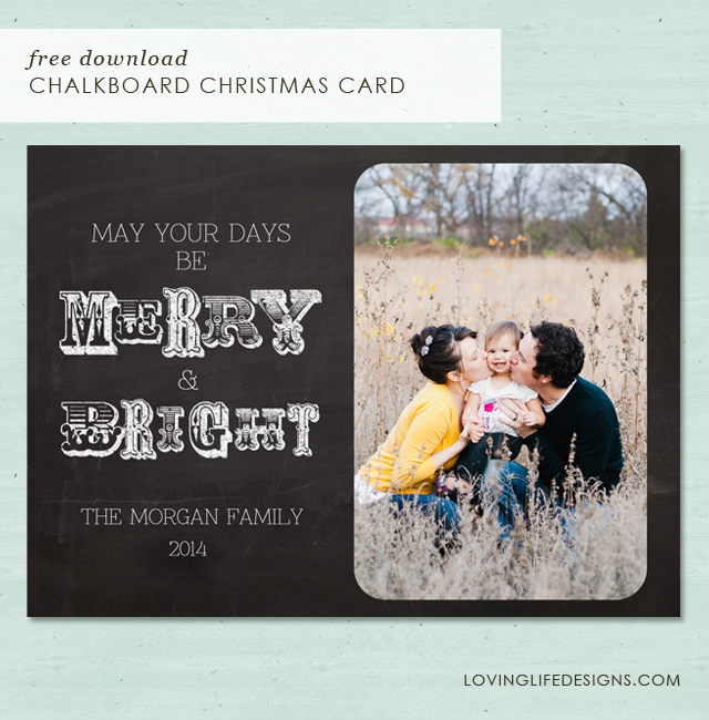
I really love it! It's a 5x7 photo card.


*Loving Life Designs downloads are for followers only. If you wish to download our creations we ask that you become a follower, it only takes a second. Thank you. 


It's a psd (photoshop) file. You can edit the "The Morgan Family" and add your own picture. The font I used is HERE, from dafont.com. It's called  Znikomit.

If you need help downloading a font and installing it, Elizabeth wrote and awesome tutorial. Go HERE to read it.

Here is a quick over view on how to add your photo to the photo card. Or any photo card for that matter.

1. Download the file. It's always best to choose your desktop so it's easier to find. It will be titled "Christmas 2012lovinglife.psd"

2. Open it up in Photoshop.

It should look like this when opened. You should see two layers in your layers palette.  One layer will be the "Merry and Bright" and the top layer is "The Morgan Family" font layer. * Remember to download and install the font before you edit the file or Photoshop will choose a different font.


3. Select the photo you would like to use and drag it into the file. Press "enter" once you get it in there.  The photo should be your top layer now.


Or you can go to "File" "Place" to open your photo in the file.


4. You are now going to drag your photo's layer and put it at the bottom of all the layers. Once there you can resize (apple "T" or Ctrl "T") and move your photo to the area it's suppose to go.


5. Now, just change "The Morgan Family" to your family name or to Love, The.... etc... it's all up to you! Just be careful about not moving the font layer. It's aligned just right under the Merry and Bright.

6. SAVE!!! I would save the psd. Then "save as" a jpeg.

7. Last thing, send the jpeg file to your local print store. Walgreens, Walmart, Costco, Sam's Club etc.

Enjoy and remember it's always FREE!!!!

Happy Christmas!!!


November 1, 2012

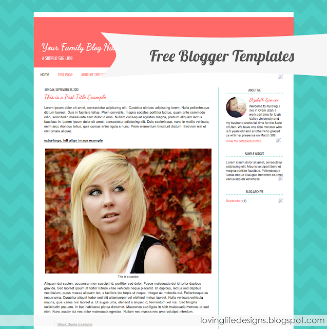
Four Free Blogger Template Designs - {Free Blog Template}

Today I have four (4) new blogger template designs for you to download.

I'm continuing to build on my Simple Two Tone Template that I rolled out a few weeks ago. I really enjoy the look and feel of this template. It's so simple and so minimalistic that readers can focus on your message and not your background.

With these new templates I am introducing a new color scheme to the mix I call it Sunshine & Clouds. Yellows and greys are the current color trend and I thought that someone somewhere might appreciate a template following the trend.


What do you get with this template design?
  • A beautiful color scheme.
  • A blog header that uses matching fonts (Dancing Script & Crushed) and colors.
  • Page navigation that uses bloggers pages widget. 
  • A custom looking about me widget that actually uses bloggers profile widget. 
  • A template that uses Bloggers Template Designer. 

*Remember Loving Life Designs downloads are for followers only. We ask that if you download our creations that you become a follower, it only takes a second. Thanks. 

In addition to the new color scheme I'm developing a Chevron Background Series. All three current color schemes (Goldfish, Pacific Pink, and Sunshine & Clouds) are part of the new series.


I'm working on a few more Holiday ideas - hopefully I can roll those out soon.

Enjoy - let me know if you have any trouble with the template or if you do install one of our templates. Leave a comment or email us we would love to see it in action. 

October 11, 2012

Introducing Free Blogger Templates - Simple Two Tone Template

We are rolling something new out, here at Loving Life Designs. We've spent a ton of time thinking about this and countless hours preparing for this, we hope you enjoy it.

Drum Roll Please

Introducing Free Blogger Templates designed by Loving Life Designs.


The great thing about these designs is that they work with bloggers designer templates and not the minima template that has mysteriously disappeared since they permanently switched everyone to the updated interface.

There are some other features that I love about these designs.
  • The Blog Title is not a picture. It is from the default blogger system. Just adjust your Blog Title and Blog Description in the configure header widget.
  • The profile/about me widget. It's got some style, no more boring profile information. The image is a cute and simple circle, created using handy CSS and your name is a font that matches the blog title and post title.
Today I would like to introduce you to our first design.

I call it Simple Two Tone. You can see a sample of the blog template here or click see the demo below.

The title says it all. It's simple, minimalistic and it's color scheme is designed with two colors that look great together.

As time passes we'll come out with some additional color combinations and some fun backgrounds but for now we have four options for you to choose from.


*We ask that if you download our creations that you become a follower, it only takes a second. Thanks. 

Halloween Color Schemes.

Candy Corn
Midnight
Download the Candy Corn template here
Download the Midnight template here

If you want a special header I created two headers for the Halloween Color Schemes

These are for the Candy Corn Color Scheme - Click to Download


These are for the Midnight Color Scheme - Click to Download


How To Install these Headers (i'll do a better post about this soon)
For now - First download the png file and save it in an easily located file. Navigate back to your blogs dashboard and click on layout. Then click edit on your header gadget. When the configure header dialog box appears under image click on choose file from your computer. Navigate to where you saved the image and click open. IMPORTANT! Make sure you have behind title and description checked.

Just for fun Color Schemes.

Pacific Pink
Goldfish
Download the Pacific Pink template here
Download the Goldfish template here

Enjoy - Let me know if you have any trouble and if you install one of our templates leave a comment or email us we would love to see it in action.

October 7, 2012

I'm a Mormon - Ann M. Dibb {Free Printable}

During the saturday morning session of  general conference Ann M. Dibbs gave a talk titled "I'm a Mormon." It was a beautiful talk aimed a the young women of the church.
Sister Ann M. Dibb, second counselor in the Young Women general presidency, recalled meeting a teenage member of the Church a few years ago. She immediately knew this sister was not from Utah because of the words on her T-shirt which read, “I'm a Mormon. Are you?” Sister Dibb was impressed by this young woman's bold declaration and pondered what her own T-shirt would figuratively say. She concluded it would read, “I'm a Mormon. I know it. I live it. I love it.” 
She said it is important to be confident in Church membership, just like the apostle Paul who said, “...I am not ashamed of the gospel of Christ. . . .” 
“Such conversion and confidence is the result of diligent and deliberate effort. It is individual. It is the process of a lifetime,” Sister Dibb said.
Read more about the talk here.

It was a wonderful talk and I was inspired to create a poster from her magnificent message.


I've created 3 files for you to download. Choose your size, print and put it in your favorite frame or gift to that young woman in your life.

 *Remember Loving Life downloads are for followers only. We ask that if you download our creations that you become a follower, it only takes a second. Thanks.


Enjoy.

September 20, 2012

How to Add a Custom Search Gadget to Blogger part II

Today I would like to present to you the second part of my two part tutorial on how to customize a search function.  You can read about the first part here.

The great thing about this is that with just a little effort and not much code you can make a functional search box that matches your blogs design.

Lets jump right in.

Our original code for the search form should look like this.

<form action="/search" id="searchthis" method="get" style="display: inline;"><input id="search-box" name="q" size="30" type="text" /> <input id="search-btn" type="submit" value="Search" /></form>

The form should look like this - 

• • • • • 

How to change the "execute search" button

Using the code from above. First delete the code value="search".

Then change type="submit" to type="image". Not to be confused with type="text" found earlier in the form. Don't delete that.

Next, add your image by adding the code src="IMAGEURL.PNG" before the type="image" but after id="search-btn".

Now you'll want to align the image by adding align="top" before the id="search-btn" code but after the input code. This is not necessary but if you having alignment issues adding this could be the solution.

The form should now look like something like this -   depending on the image you used.

and your code should look like this

<form action="/search" id="searchthis" method="get" style="display: inline;"><input id="search-box" name="q" size="30" type="text" /> <input align="top" id="search-btn" src="IMGURL.png" type="image" /></form>

Note:
If you are in need of an image to use I have this one    and this one .

The url for the first is http://i1251.photobucket.com/albums/hh552/lovinglifedesigns/SearchButton.png

and the url for the second is http://i1251.photobucket.com/albums/hh552/lovinglifedesigns/search_btn.png

 for more search buttons do a quick internet search, you'll find thousands of ideas.

• • • • • 

How to change the Border and Background colors of the search form

This one is pretty easy. All you need to do is add an inline style to the search form. I've added it after the name="q" and before the size="30" codes.

Example 1 - 

In this first example I added a red dashed border by adding the following code style="border: 1px dashed red"

Example 2 - 

In this example I added a purple border and a pink background by added the following code style="border: 1px dashed #8d38c9; background:#FAAFBA;"

Example 3 - 

In this last example I added a goldenrod background by added the following code style="background:#FAAFBA;"

My completed form code for example 3 looks like this:

<form action="/search" id="searchthis" method="get" style="display: inline;"><input id="search-box" name="q" style="background:#FAAFBA;" size="30" type="text" /> <input id="search-btn" type="submit" value="Search" /></form>

Here are some useful resources to help with color and border properties.

  • For more information on CSS borders take a look at this tutorial by W3Schools . 
  • For more information on HTML color codes take a look here at computer hope . 
  • For ideas on color combinations take a look here at colorlovers web trends.  
• • • • • 

How to Change the Text Properties of the search form

To change your text properties, like changing the text color or making the text uppercase,  you again need to add an inline style to the search form.

To change the text transformation add text-transform:uppercase;.

Example 1 - 

To change the text color you need to add a color: #HTMLCODE;.

Example 2 - 

*Remember you need to add words to the search box in order for this option to work. You can learn about that from my last tutorial.

My completed search form code for the above example looks like this:

<form action="/search" id="searchthis" method="get" style="display: inline;"><input id="search-box" name="q" style="text-transform:uppercase; color:#c38ec7;" size="30" type="text" value="keyword search" /> <input id="search-btn" type="submit" value="Search" /></form>

Here is a great resource on text properties from HTML help.

There you have it folks a simple, totally customizable, yet powerful search function. I hope that this tutorial is helpful. Please let me know if you have any questions I will be happy to try and help.

Happy Coding.

August 3, 2012

How to Add a Custom Search Gadget to Blogger

I can't believe that the last time michelle and I posted anything on this blog was April 25th. Seriously SO SORRY.

We're still here I promise.

Today have a two part tutorial on how to add a custom search gadget to blogger. The title should almost be a SIMPLE Custom Search Gadget for Blogger. It really is that easy to add and customize.

Having a search feature on you blog can save readers a bunch of time if they are looking for something specific or a certain topic. Plus, like I said earlier, adding one is so incredibly easy that there isn't a reason in the world you shouldn't have one; and you'll wonder why it took you so long to add it.

The easiest way to add search function is to add the blogger team designed gadget "search box".  It's a fine option if you wish to have a generic look to the search box. It says it's a custom google search but that just means you can add different variables to search; for instance you could have it search not only your blog, but google, and your blog roll. That seems to be all the customization available.

And it would look something like this.


Doesn't inspire too much creativity does it. After all you've spent countless hours making your blog look the way you want it to look. A generic search function just stands out and doesn't blend with the look and feel of your custom blog design. Wouldn't you rather it look something like this?


or this?

or maybe even this?


So here we go How to Add a Custom Search Gadget to Blogger

First things first lets add the search box to your page and then we'll discuss a few quick changes.

1. Go to Dashboard > Design > Page Elements > and select "Add a gadget" > then click the plus sign (looks like this   ) next to the HTML/Javascript.

2. Copy and paste the following code to the content box.

<form action="/search" id="searchthis" method="get" style="display: inline;">
<input id="search-box" name="q" size="30" type="text" /> <input id="search-btn" type="submit" value="Search" /></form>

3. Save and Viola, you are done.

Now lets show you some quick ways to customize the search function.

Add words to the search box.  Currently the box is blank. add the following code value="keyword search" right after the code type="text" but before the />. You can change the text inside the quotes to whatever you want. For example you could have it say "search" "search loving life" or "enter keyword". It's whatever floats your boat, it's your search function.

Change the word in the enter button. This is easy! Find the code value="search" and again change the text inside the quotes to whatever you want. For example it could say "go" or "find". Seriously whatever.

Change the width of the search box. lets say that you want this in your sidebar but it's too long. Find the code size="30" and adjust the number up or down. A larger number will make a longer search box, a smaller number will make a shorter text box. Play around with the number to find the right feel.

I think that is all for now. Next post I'll show you how to change the background color, the border, the text and switch the search button to a picture.

If you are having trouble with the search function or have a question leave a comment or email us and we will see what we can do.

EDIT:

I was asked how to make the search box higher not wider. The best way to do that is add some style to the search form.

<form action="/search" id="searchthis" method="get" style="display: inline;">
<input id="search-box" name="q" size="30" style="height:30px;" type="text" /> <input id="search-btn" type="submit" value="Search" /></form>

Adding a style="height:30px;" makes it look like this. 


April 25, 2012

Long Absence

I wanted to apologize for our absence. Michelle just started a new full time position (yeah for her) and I gave birth to a wonderful baby girl on March 30th.

We are deeply sorry about the absence. Here are some pictures of my new little one to tide you over.


Add a "View my Instagram Gallery" link to your Instagram Widget

Remember how a LONG time ago I posted about Adding an Instagram Widget to Blogger Sidebar.

Well, Today I would like to show you how to add the View my Gallery Image to the bottom of your widget.


Don't worry I didn't steal this little picture from anywhere or anyone. I created it myself.

First things first, login to Followgram.

Near the top of your login dashboard should be two windows. Get your follow button - Get the Code and Get your vanity url - Get url. 

Ignore the first window. We want the vanity URL. 


The code should look similar to this http://followgram.me/YOURUSERNAME

Copy and Paste the vanity URL into a simple text editor.

Now copy and paste the following code into your text editor.

<a href="VANITY URL HERE" target="_blank"><img alt="view my instagram gallery" height="auto" src="http://i1251.photobucket.com/albums/hh552/lovinglifedesigns/ViewmyInstagramGallery.png" width="100%" /></a>

Now re-copy your vanity URL, that you should have already saved in the text editor, and replace VANITY URL HERE with the actual vanity URL. *Make sure you keep the quotation marks.

Finally copy the entire code (<a to /a>) and login to Blogger, go to DESIGN and then PAGE ELEMENTS. Open the HTML/Javascript widget you've already created from my last tutorial, and add the new code to the bottom of the HTML code that is already there. *You can place the code at the top/before the old code if you want the image link before your Instagram images.

Save the widget.

Viola, you are done.

If you have any questions on how to do this please feel free to leave a comment and I will be happy to answer your question. And if you apply this to your blog I would love to see it in action. Leave a comment and post a link.

You can see the effect in action at my example blog.

March 25, 2012

Add a Hover Effect to Blogger Navbar - Blogger Tutorial

Have you ever noticed the blogger navbar at the top of Lovinglife?

You know this UGLY thing?


Have you ever hovered your mouse over that area (on lovinglife) and noticed that it appears and then disappears when you move your mouse away? Ever wanted to do the same thing on your blog?

It only takes a minute. Give it a try.

How to add a hover effect to blogger navbar: A Blogspot Tutorial

1. Go to your design tab in your blogger dashboard.  Click on edit HTML.

2. Scroll down and find
body {
3. Copy and add the following code just above it.
#navbar-iframe{opacity:0.0;filter:alpha(Opacity=0)}
#navbar-iframe:hover{opacity:1.0;filter:alpha(Opacity=100, FinishedOpacity=100)}
4. Save your template.

Viola, you are done! Now view the awesomeness of the hover effect for the blogger navbar.

If you have any questions feel free to leave a comment and I will be happy to answer them. If you apply this to your blog, I would love to see it in action. Leave a comment and post a link to your blog. 

*I don't generally suggest deleting the Blogger navbar because it is useful in Blogger SEO (Search Engine Optimization). Adding the hover effect doesn't do anything to your blogs SEO.

March 22, 2012

Instagram Sidebar Widget for Blogger

The other day I was asked about my Instagram sidebar widget that I have on my personal blog. They wanted to know where I had gotten it. Truth be told I made it. It's just a simple HTML/Javascript widget that anyone can do. I figured it would be a great idea to post a tutorial on how to make the widget. SERIOUSLY SO EASY!

First things first your going to need to have an instagram account. I'll let you figure that out.


Next you'll want to signup for Followgram.


 Followgram is a web app developed as a way to extend those Instagram's basic functions so appealing to millions of users already. At least that's what they say. It's just a way to see your instagram pictures online in a gallery setting. It's twitter for pictures. Sort of like Pinterest is twitter for creative ideas. 


Before you create the widget you'll need to pick the instagram pictures you would like to use for your widget and get the url of the picture. You can have as many pictures as you would like. I have like 8 pictures on my widget.

To find the URL - First login to followgram and get to your dashboard.


Next click on the picture you would like to use and get to that individual pictures dashboard.


Right click on the image and select view image


The picture now should be the only thing on the screen.


On this screen, in the address bar, there should be the direct link URL to the image.


The direct link URL to this Winnie the Pooh quote is

http://distilleryimage6.s3.amazonaws.com/9b878340695e11e180d51231380fcd7e_7.jpg

Copy the code and save it to a simple text editing document (notepad for PC and textedit for Mac. Don't open a complex word processing application like Microsoft Word. Just use something simple.)

Now go back to your Followgram Dashboard and follow those same steps again until you have gotten the URL's to all the pictures you would like to use. 

These are the 4 pictures I've chosen to use in this widget.


See how I have the unique URL to each image copied to my text editor.


Now it's time to start and finish building the Widget.

Copy and paste the following code into your text editor.


Replace UNIQUE URL with one of the URL's that you have retrieved and saved. For Web Accessibly change the UNIQUE ALT to a short description of the picture. No need to change the height or width. The 100% percentage code will automatically make the image the size of your sidebar.

I was looking at my example blog and I noticed that the 100% code renders different in different browsers. For instance on safari it stretches the photo and in google chrome the picture looks correct. I am adjusting my instructions and I think it would be more advantageous to code the image with the sidebars pixel width. 

on my example blog the side bars width is 220px. Instead of having the width and heights be 100% change it to 220px. your height and width code should look like this.
height="220px" width="220px"
For example this will be the code for the Winnie the Pooh quote.


*PLEASE NOTE: DO NOT DELETE THE QUOTATION MARKS OR IT WON'T CODE RIGHT.

Here is a look at the final code for all four images.


Finally create a new sidebar gadget. Select the HTML/Javascript widget gadget and add YOUR final code to the widget gadget. I suggest building the code in the text editor and then just copy/pasting it in the HTML/Javascript gadget.

Viola! You are done!


*ONE FINAL NOTE: This is not an automatically updating widget. If you want to change the images to more current pictures you will have to do this all over again. But once you've done it a few times you'll be a pro.

To see what the widget looks like with these 4 images you can see it on my example blog. To just see the widget with other images you can view it on my personal blog.

If you have any questions on how to do this please feel free to leave a comment and I will be happy to answer your question. And if you apply this to your blog I would love to see it in action. Leave a comment and post a link. 

I'll be posting a tutorial on how to add the view my gallery link to your blog soon.